@ GeoB99: Thanks. Yes, I plan to make that test across multiple platforms to see if it works. Win, Linux and Mac. Mac has the lowest prio to me though. Linux is crucial because I want to have Linux dedicated servers like in CS2D.
Details will be announced in the blog as soon as the stuff is ready.
The "pooling" bug, if controlled, can make a nice GUI menu animation: when you switch screens, the buttons will be assembled out of scrabled pieces from across the monitor (or in a small radius around the object). It should take 100-200ms so it doesn't become annoying.
The current inventory tabs approach is surely the standard one, but I don't think it's very comfortable to use (and this depends on how each player uses the inventory, however).
What I imagine is this: after you've used the inventory, you'll get used (hah, pun!) to the order of items in it (when my inventory doesn't go over 5 screens, I will not make use of tabs because of the 1 extra click). Therefore once you click on a tab, the whole item order (which you kind of memorised) is messed up and you have to visually orient yourself first before you'll see the wanted item. TL;DR: The brain gets used to the item order.
Hence my suggestion is: if the whole inventory fits into one screen, instead of removing items from other categories simply hide them (opacity of 0-10%) so the item order is not changed.
Regarding the categories:
Interesting idea but I guess it's not that good anymore if you really have a lot of items and actually have to scroll a lot to see them all. In that case it is probably better to only show the items of the chosen category like it's currently implemented. It's my plan to have many different items - therefore I will stick to the current solution for now.
If you prefer the Stranded I and II way you can just ignore the categories and only use the "all"-tab
there's an easy solution for @ 
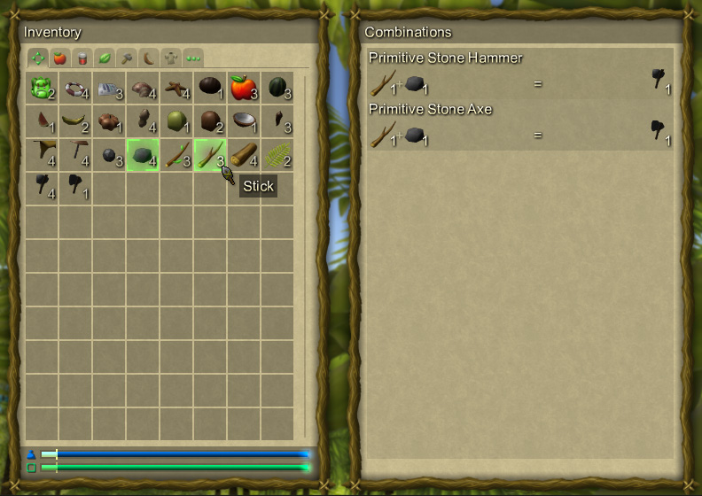
VADemon's problem: add a search bar (magnifying glass in the top right corner which when clicked expands a text field to the left) into which the player can type keywords and all items which do not have this string as a substring in their name or description will be greyed out while those that do have it as a substring get highlighted by a border. Path of Exile has such a system in place which works quite nicely.
as for my own feedback, I'd recommend to keep the middle of the screen free from any menus so that the player can always see what's going on in front of him. apart from PoE which does this, I also have this example from Risen where a similar menu with tabs is neatly packed into a small window on the side.
Stranded 2 pretty much blocked your view when you opened any menu.
as a side-note on that: in S2 the menus always had the same size which was optimized for the smallest resolution (800*600 I think?) and on bigger resolutions it was anchored in the top left corner.
Unity's "new" UI system should allow to scale the interface (e.g. by a slider in an options menu) to fit the player's preferences. any plans on that yet?
also, back in the day there were some ideas about multiple bags. is that still on the table? if yes, will it be possible to open multiple inventory windows and drag items between bags for personal item sorting? if yes again, how about only showing tabs if they actually have items in them to help the player if he's searching for something so he doesn't have to look through too many empty tabs?
as for my own feedback, I'd recommend to keep the middle of the screen free from any menus so that the player can always see what's going on in front of him. apart from PoE which does this, I also have this example from Risen where a similar menu with tabs is neatly packed into a small window on the side.
Stranded 2 pretty much blocked your view when you opened any menu.
I like that it blocks your view. When you open your backpack in real life to take a look at it, you can't see anything in front of you either
I'm not using Unity UI. The whole UI is written in Lua, based on a simple 2D API I exposed to Lua. So the fancy layouting stuff isn't there out of the box but of course you can implement it yourself. For automatic placement of UI elements in windows I already did that.
The planning regarding layout and scaling is not final yet. I'm still trying out things. I like the idea of keeping the center of the screen free. This would be easy to achieve when displaying the menus at the same size in higher resolutions. Currently I'm using 800x600 for development as it fits into the Unity editor window. So all menus will work with this as minimum resolution. And yes, it was the same in Stranded II.
I'm not sure if I will keep the multiple bags approach but the current system is designed with this possibility in mind. The item window just shows all items which are stored inside somewhere and you could easily open (and also move) multiple item windows.
Not sure if a search bar would make sense but of course only showing tabs for items you actually have would be a good thing.
Hmm...maybe a semi-transparent inventory menu would be good. With exception to the item icons, having them be solid. I could see everything in view, and the solid icons would not really block the entire area they sit in...basically you would see "between" them if you made a tiny bit of space between the icons. Spacing both ways, horizontally and vertically...to serve this very purpose.
I tend to think spaced icons look more organized and easier & more pleasing, on & to the eyes, in general.
The comment by DC from Disqus related to Dev Blog 54:
− UnrealSoftware
2 months ago
> Milan Fašina
I actually prefer to have everything related to items in one menu but I agree that the selection-system in Stranded I and II was really annoying.
My current idea to solve this issue is to use a simple hotkey. It works exactly like selecting multiple files in Windows: hold CTRL and click stuff to select/deselect it. No additional buttons required. Really simple but powerful.
Clicking one item WITHOUT holding CTRL will of course deselect all other items. <...>
So, why isn't it, but the same system from SI-SII (just by left-clicking without a hotkey)? Seems not so comfortable when just clicking items to see descriptions or weight, for example.
And sorry for bad English...
@ JaSTeRoN: The CTRL approach was my idea for having everything in one menu. Now you have a separate menu for crafting and therefore you don't need it anymore.
You can see details anyway by hovering items because it gives you a tooltip. No need to click them first.
@ DC: Sorry for intruding, but if player press "Shift" button it`s accelerate him? As in most games on the Source engine.
Then, most of weapons should be hard to take control. Since I'm playing this game, I never get hard at aim. I mean, your idea is really cool but the thing is, even if DC would do that, there won't be large changes exactly.